Did you know all CX survey scores are not equal? Not even close! In order to create a customer satisfaction survey that’s fair, there’s a number of things you have to consider – from the survey questions, to the rating system, to the collection method. In order to get a realistic view, you need to be mindful of all of them.

All survey scores are not equal
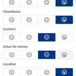
When we came across this survey recently, from an organisation that suggests they will improve customer satisfaction overnight – and we realised how, as we immediately recognised a skewed rating system. Have a look for yourself, and see if you can figure out how the 9.2 review score was calculated.
Stuck?
Well, from left to right, the smiley faces are apportioned 2.5 points, 5, 7.5 and 10 points. And those smiley faces seem to indicate unhappy, neutral, happy and delighted (although there’s not actually an explanation as to whether that’s the case). Does that seem fair?
Probably not, and it raises a number of interesting points.
The first is that you can see two positive reactions, but just one negative and one neutral position. So, users are already pushed towards positive feedback, by virtue of two of the four options being positive.
In fact, if you rate something using Smile 2 (‘neutral’), you’re actually awarding 5 out of 10 points. If you didn’t look closely at that picture, you might assume that given its placement it would indicate ‘quite dissatisfied’, which definitely wouldn’t warrant 5/10 to the average user!
At VirtuaTell, if we’re using a four-point scale, we use 0, 3.3, 6.6 and 10 as the points for each position. This allows for the reviewer to indicate that something is so bad they wouldn’t award any points, and is a much more realistic way of measuring satisfaction.
Four-point scales are intrinsically problematic though, as there is no middle position to allow users to show that they are neither satisfied nor dissatisfied. Not allowing customers to adopt a neutral position does force them to pick a position, but in the case of this scale, where the positions are weighted towards the positive, this won’t give an accurate assessment of customer satisfaction.
The other issue with this survey is that there’s no way of showing that any of the questions aren’t relevant for this user. For instance, perhaps the user didn’t make use of the facilities, or didn’t have any interactions with the staff – they should be able to complete the survey without being forced to have an opinion on these things!
Perhaps you’ve already worked out why this survey is designed in this way…
Rather than trying to gather realistic data that the company will use to improve its offering, the results of this survey are used for review purposes and shown to website visitors – in this case, people booking hotels online. So, a high score gives the impression of hundreds of satisfied customers, and more chance of a booking by the potential customer!
But while this might work for first purchase on-site conversion rates, ultimately this strategy is risky. After all, if you visit a hotel based on a 9.5 rating, but go there and have a 5.5 experience, you may accept that it is “just you” but if it happens repeatedly, will you book with that company again? Probably not!
As you can see, survey design needs to be done carefully, and while it might be tempting to skew the results so that you get positive feedback, that, ultimately, won’t help your business.
Want to discuss with experts whether you’re getting a true reflection of your customers’ levels of satisfaction? More details about scales and scoring can be found [[HERE]]. Or, schedule a call to discuss it with one of our team members today.


Recent Comments