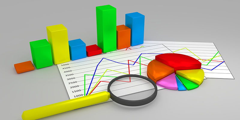
You’re swimming in data! Your survey has been an unprecedented success! There are numbers everywhere! But wait just a minute. Do you have the nagging feeling that you’re not done yet? Yes, next up is the analysis, and this is where things get chart-y.
Whilst there are people in the world who can digest and understand enormous columns of numbers, it’s not most people. A visual representation of your data, if presented in the right way, can unlock the secrets it holds for the whole company, regardless of your analytic skill level. You’ll find that a picture paints a thousand words – these charts will uncover the real meaning hidden in the mega-tons of data collected from surveys, so you can really start making changes based on your findings.
But when to apply which type of chart? The VirtuaTell Reporting Portal has got all the answers, but we didn’t just want to show you some meaningless stats. We’re zeitgeisty! We’re current! We’re excited about the new Top Gear!
Yes, we have mocked up some (entirely made-up) graphs, to celebrate the imminent return of Top Gear and illustrate the world of data visualisation.
Line graphs
Best used: to illustrate trends and identify whether two variables relate with one another. Ideal to see progress over time.
Bar graph
Best used: to show the relationships between varied data series. The value or frequency is represented by the height of the bar. The higher or longer the bar, the greater the value.
Pie chart
Best used: to compare the different parts to a whole or its percentage distribution. The whole pie is a representation of the total data set and every segment of the pie is a particular category within the whole. We often use a pie chart to show the 3 sectors of an NPS score together with a doughnut chart to show the 11 sub-sectors.
Tables
Typically, we use tables to show team results and survey conversion statistics. The teams can be grouped together to allow simple comparison across the whole organisation, expanding down the hierarchy, as required. Often tables can be grouped together with graphic charts to provide the background statistics relating to the graph.
Alternatively, they’re good for displaying Stars In Reasonably Priced Cars lap times, together with the car they were driving…
Venn Diagram
Best used: to show the overlap between sets of data. Each set is represented by a circle. The degree of overlap between the sets is depicted by the overlap between circles.
This type of chart goes one better than merely identifying the similarities and differences found in two things – they enable you to establish categories of things, and their relationship to each other.
If you’d like to know our thoughts on Jaguar’s newly announced SUV, or you want to know how we can help you understand your customer data more clearly, email us here.


Recent Comments